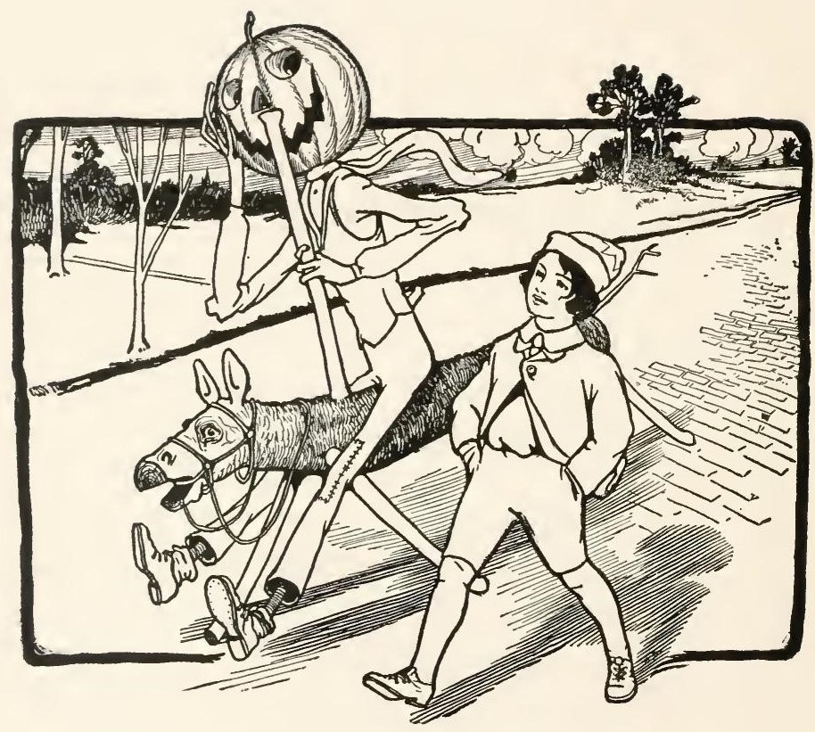
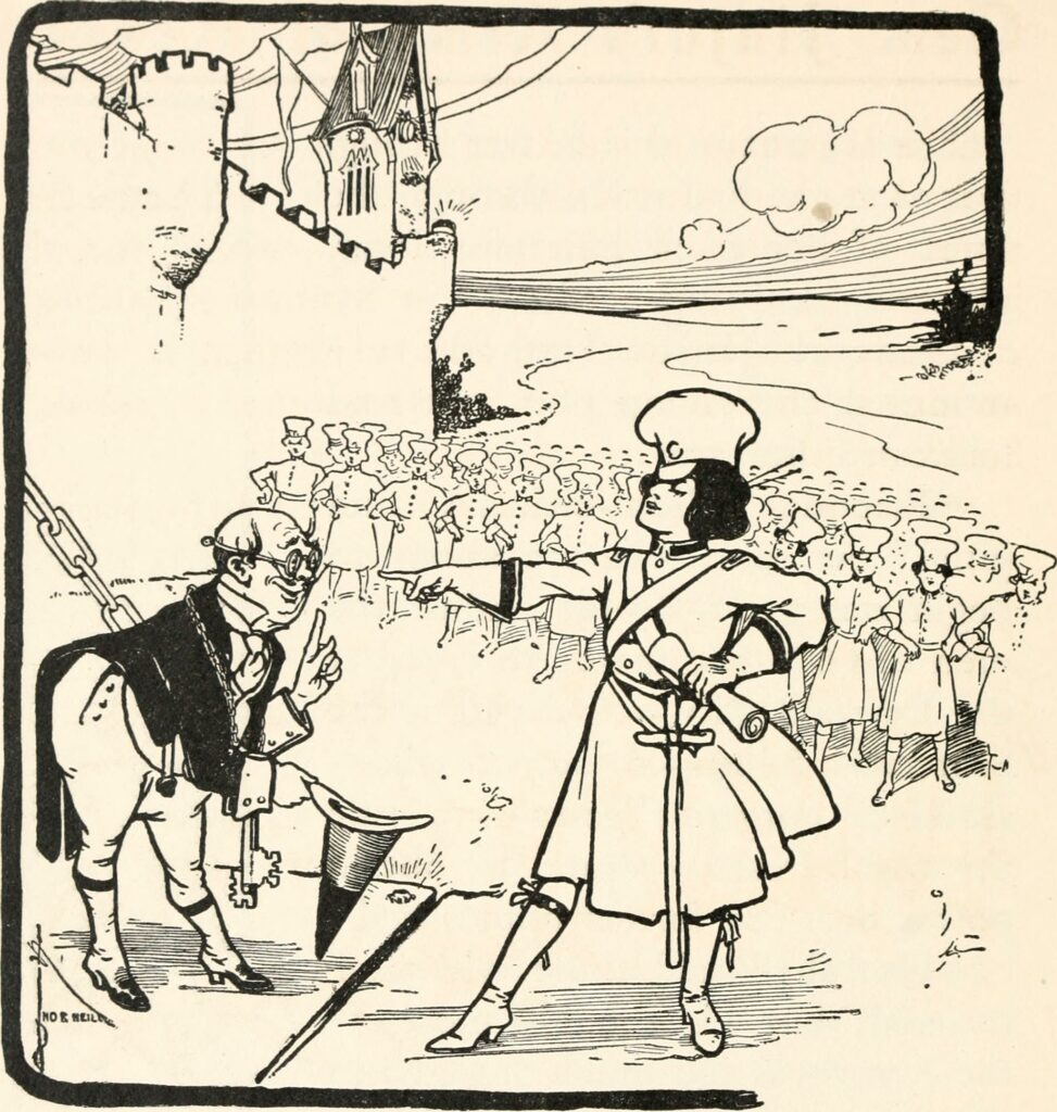
In the original novel, Denslow’s illustrations are as pivotal to the story as the text, to the extent that he shared the copyright with Baum. However, Baum and Denslow parted ways during the four years that passed between The Wonderful Wizard and The Marvelous Land. The new illustrator, John R. Neill, would handle the artwork for the remainder of the series and even wrote a few Oz books of his own. Fortunately, Neill continues the strong color themes of Denslow’s drawings: green is associated with the Emerald City and its territory, yellow with the Winkie country of the west (that famous Wicked Witch is not really green), red with Glinda and the Quadlings of the south, blue with the Munchkins of the east, and purple with the Gillikins of the north. Occasionally, Neill conflicts with Baum, such as depicting Jinjur smiling imperiously to the Guardian of the Gate (page 90) when the text is clear that she is scowling: “‘Surrender instantly!’ answered General Jinjur, standing before him and frowning as terribly as her pretty face would allow her to” (91).
Neill’s drawings are of a more realistic style than Denslow’s rather eerie cartoons. But the solid linework makes for highly attractive illustrations more interesting than the text. I sometimes wonder about the rationale behind giving certain scenes full-color illustrations. These should be used like prerendered cutscenes in a PS1 video game, punctuating pivotal moments. Sometimes they do, but other times they seem chosen almost at random. Never fear, for Neill’s drawings might be scarier than Denslow’s.
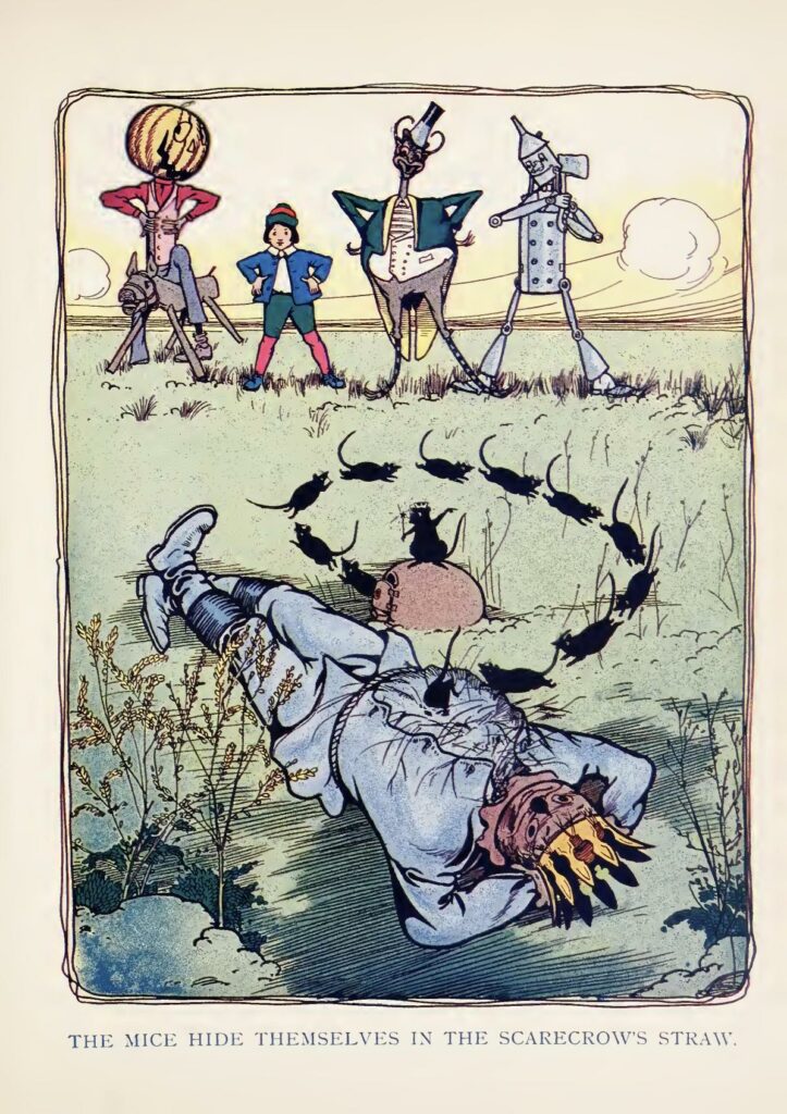
Neill loves emphasizing that the Scarecrow is, indeed, a scarecrow, straw protruding from the seams, his expression never changing, and his fingers and limbs pointing at angles that would imply devastating pain for a human. Neill lovingly illustrates Baum’s descriptions of the Scarecrow, among other things, having his straw removed for the Winkies to wash his skin in the laundry.
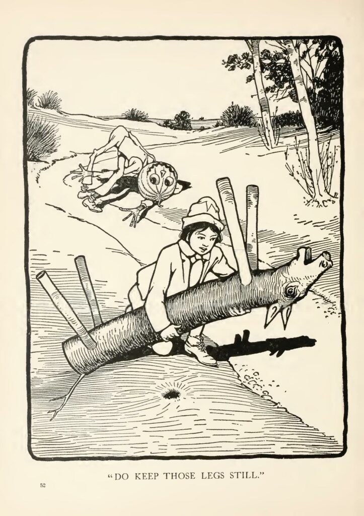
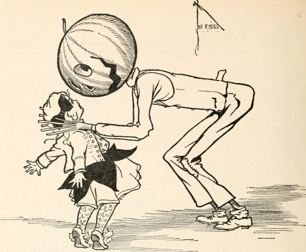
I mentioned that Jack Pumpkinhead is terrifying. Indeed, Tip builds him to scare Mombi. However, the characters react positively to his smile and empty eyes. The frequency with which Jack’s body breaks, his limbs twist and swivel at alarming angles, and the repeated allusions to his inevitable rapid death when his head soon rots are played for laughs. Baum and Neill seem to intend this walking nightmare to be cute and comical! There might be a moral here about not judging people on their appearance because Jack is a sweetheart. Really, most of the crew is frightening at a glance. (Compare that to the 1939 film explicitly teaching that ugly people are evil.)
